Reducing filters friction

Role:Lead product designer
Company:Productboard
Duration:4 months
Type:New feature
Reducing filters friction hero

Intro

(Project overview)

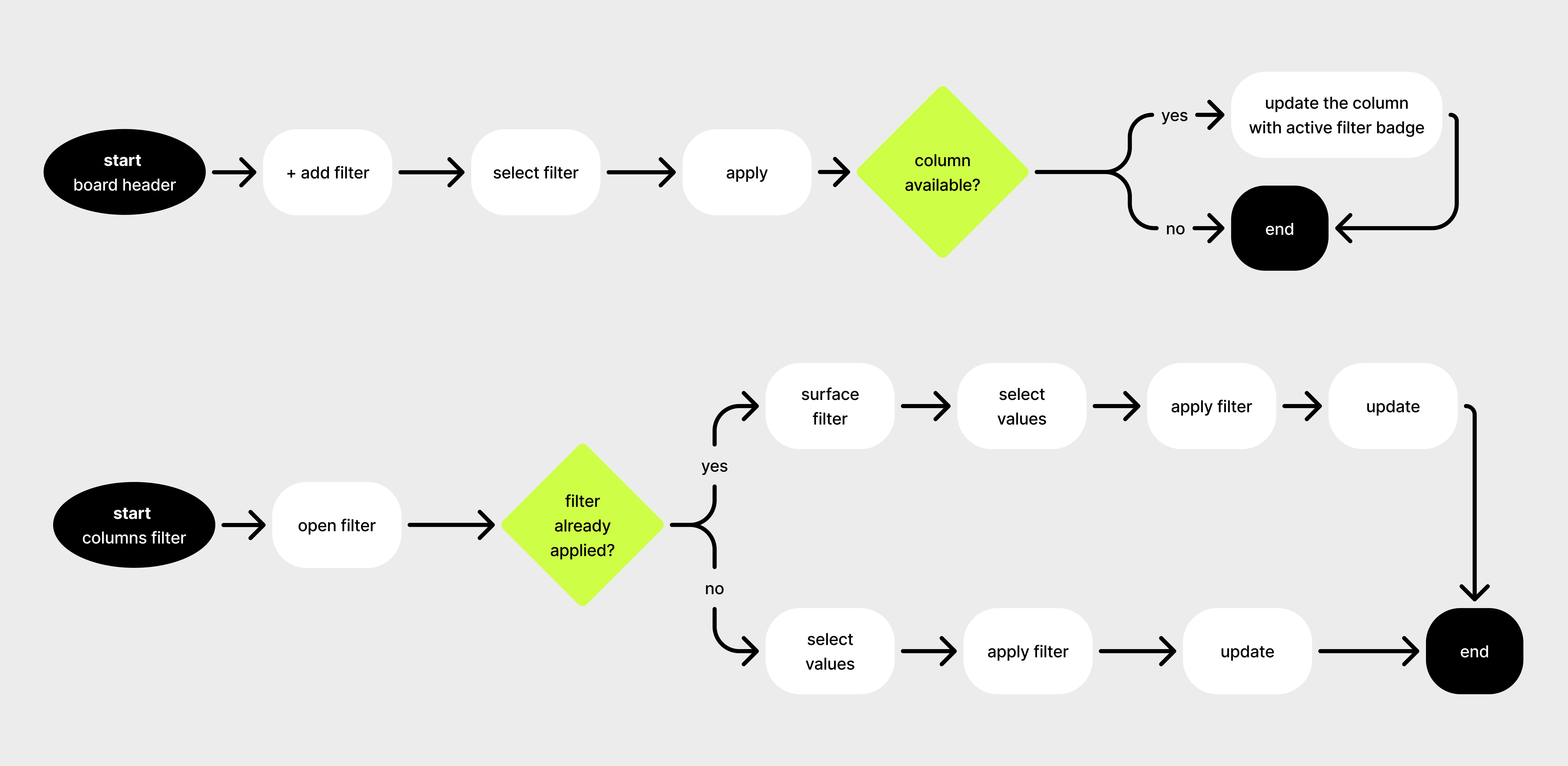
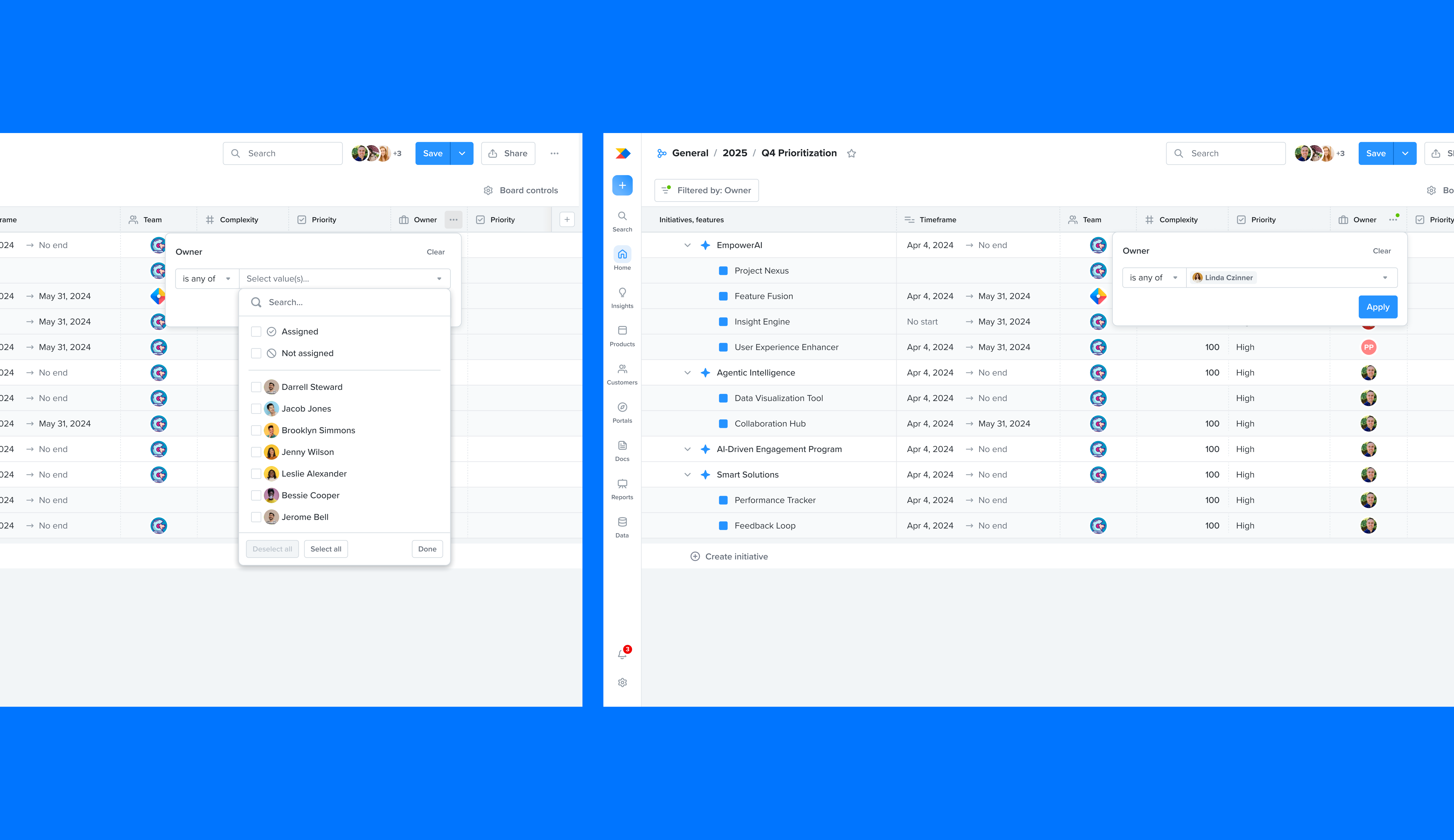
Productboard helps product teams prioritize and align around what to build next. At the center of that workflow is filtering - the mechanism that lets teams cut through hundreds of features and initiatives to focus on what matters right now. Filtering was one of the most complained-about interactions on the platform. I led the discovery and end-to-end design of column filters: a new way to filter directly from the grid board.

(Goal)

Reduce friction for the majority of users who found Productboard's filtering system intimidating.

(My role)

I owned the full design process: identifying the problem through research, framing the opportunity, running user testing, designing the interaction, and tracking outcomes post-launch. I collaborated closely with engineering on scope and feasibility, and with Product on prioritization.

Problem statement

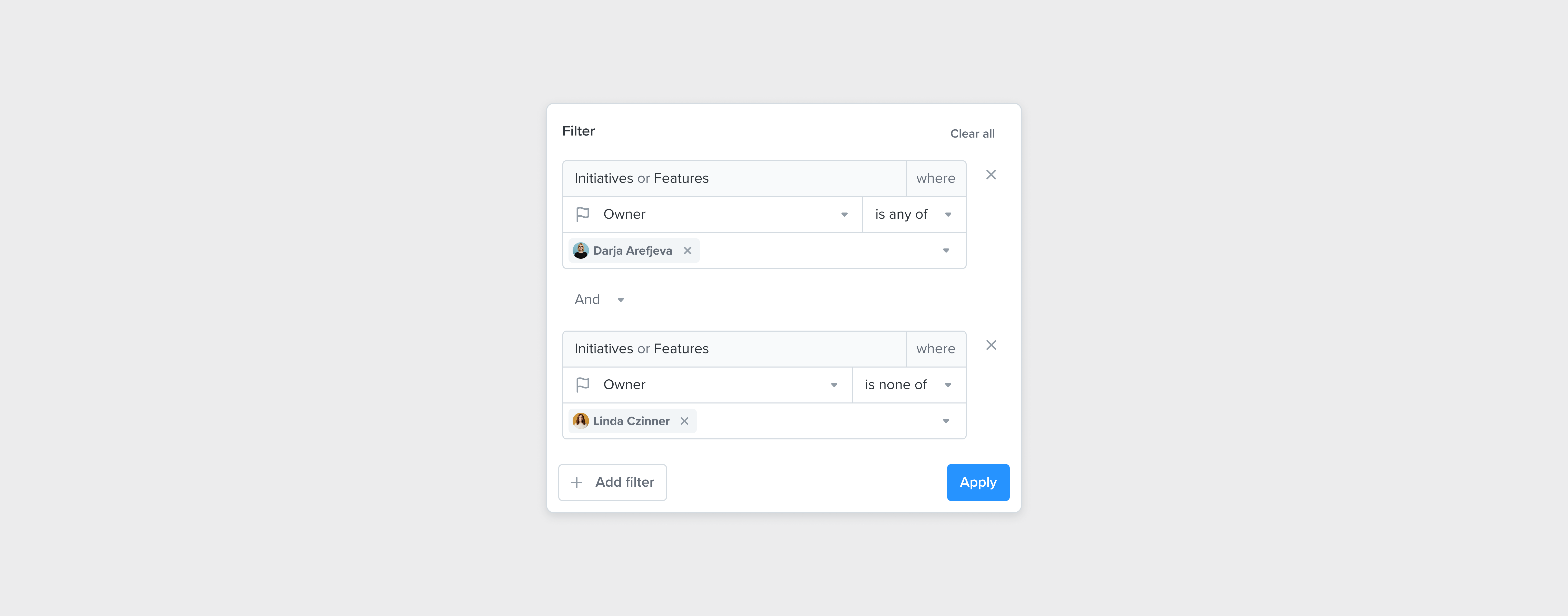
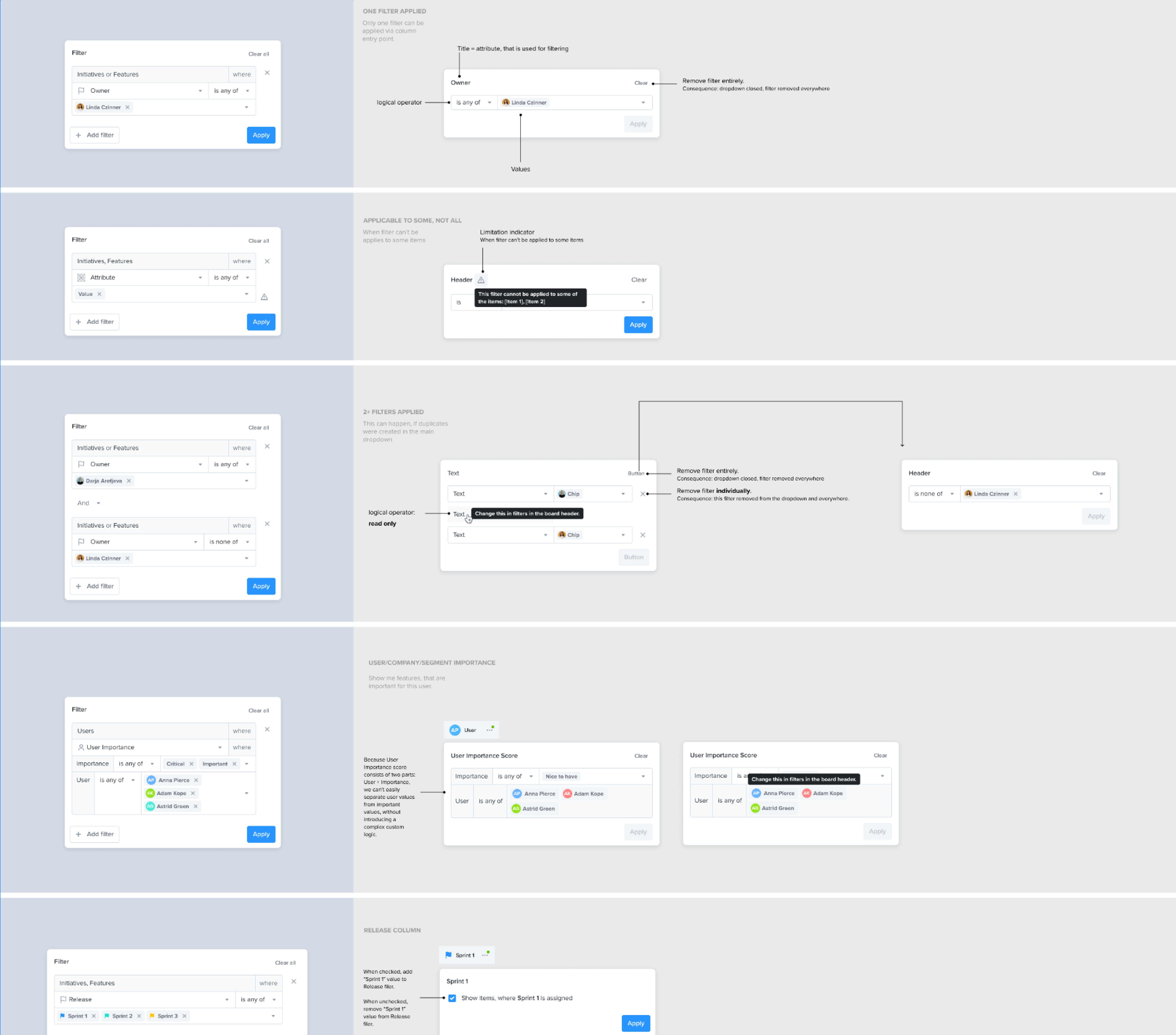
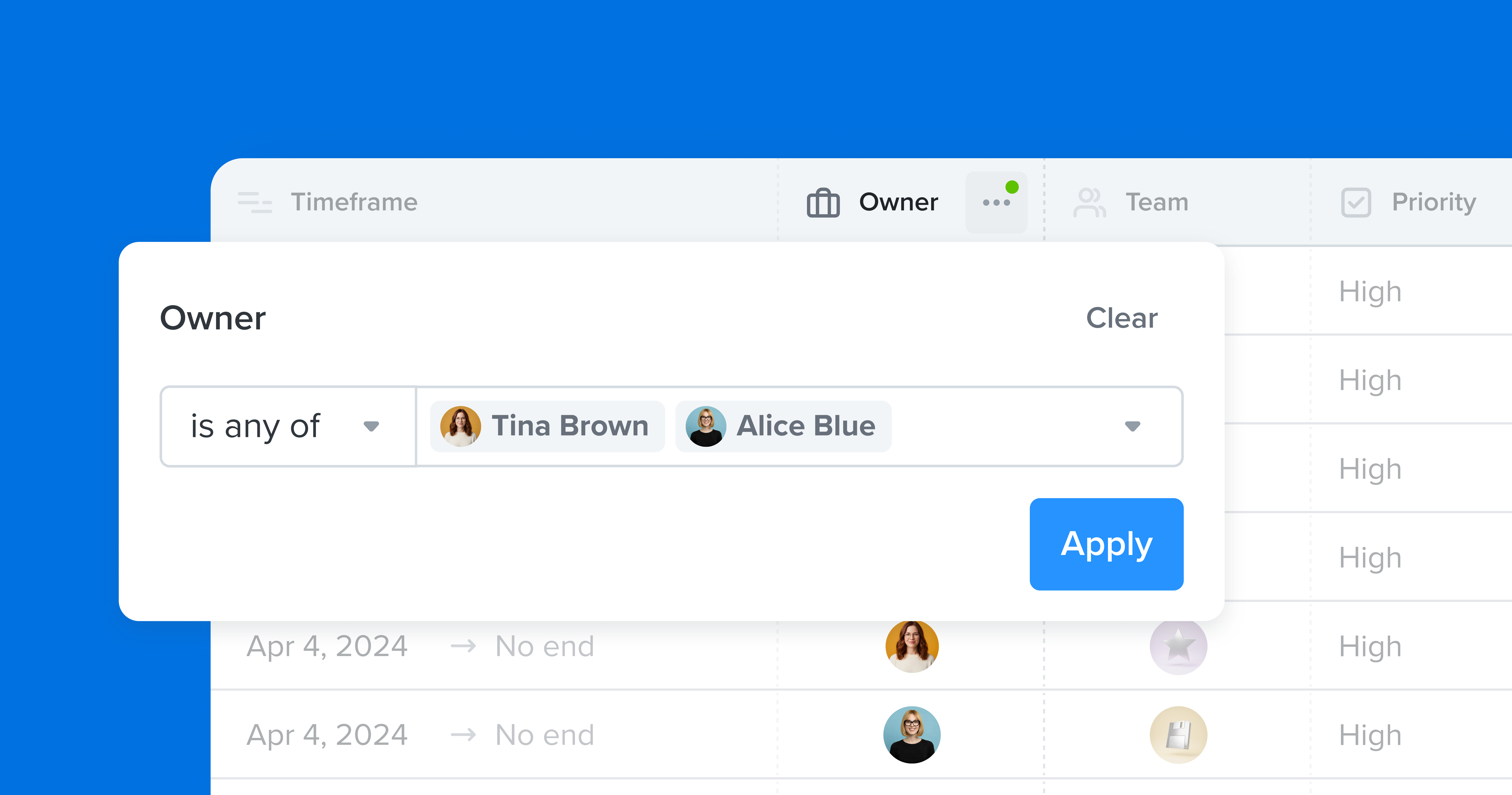
Productboard has two filter modes built for different audiences. Simple filters covered everyday use cases. Advanced filters supported complex, flexible filtering logic for power users. Both were accessed through the same place: the board header filter panel.

The panel presented users with an abstract, open-ended interface. To filter anything, you first had to select an attribute - choosing from a list of all possible properties in the data model. Then pick an operator. Then pick values. Even a simple question like "show me only Anna's items" required navigating a query-building flow.

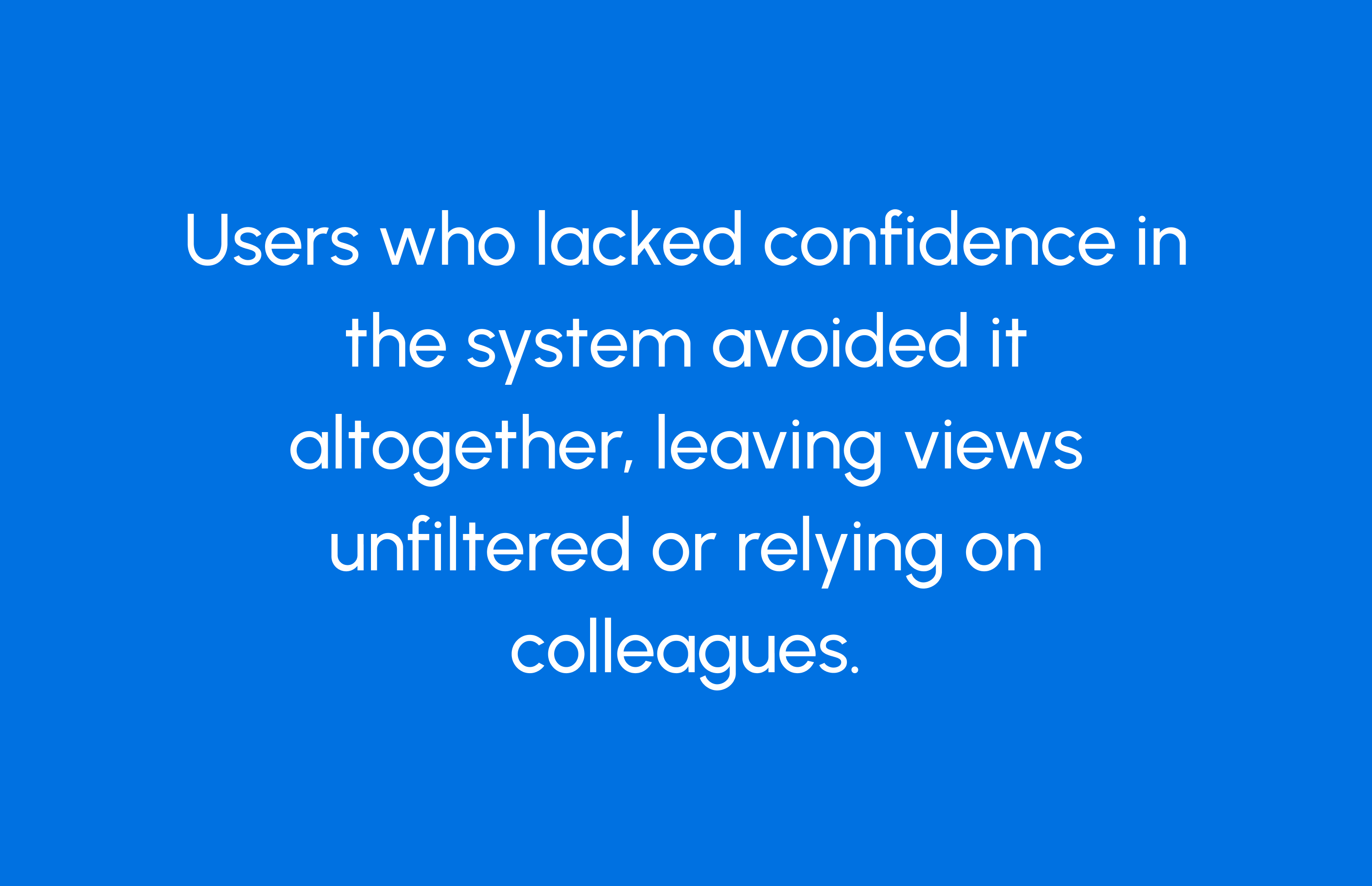
For users who understood the data model, this was fine. For everyone else, it was a barrier. Feedback described it as "confusing," "intimidating," and - repeatedly - "awful."

If we give users a filtering experience that eliminates attribute selection entirely - where the context is already set by what they're looking at - they'll be able to filter without needing to understand the filter system at all.
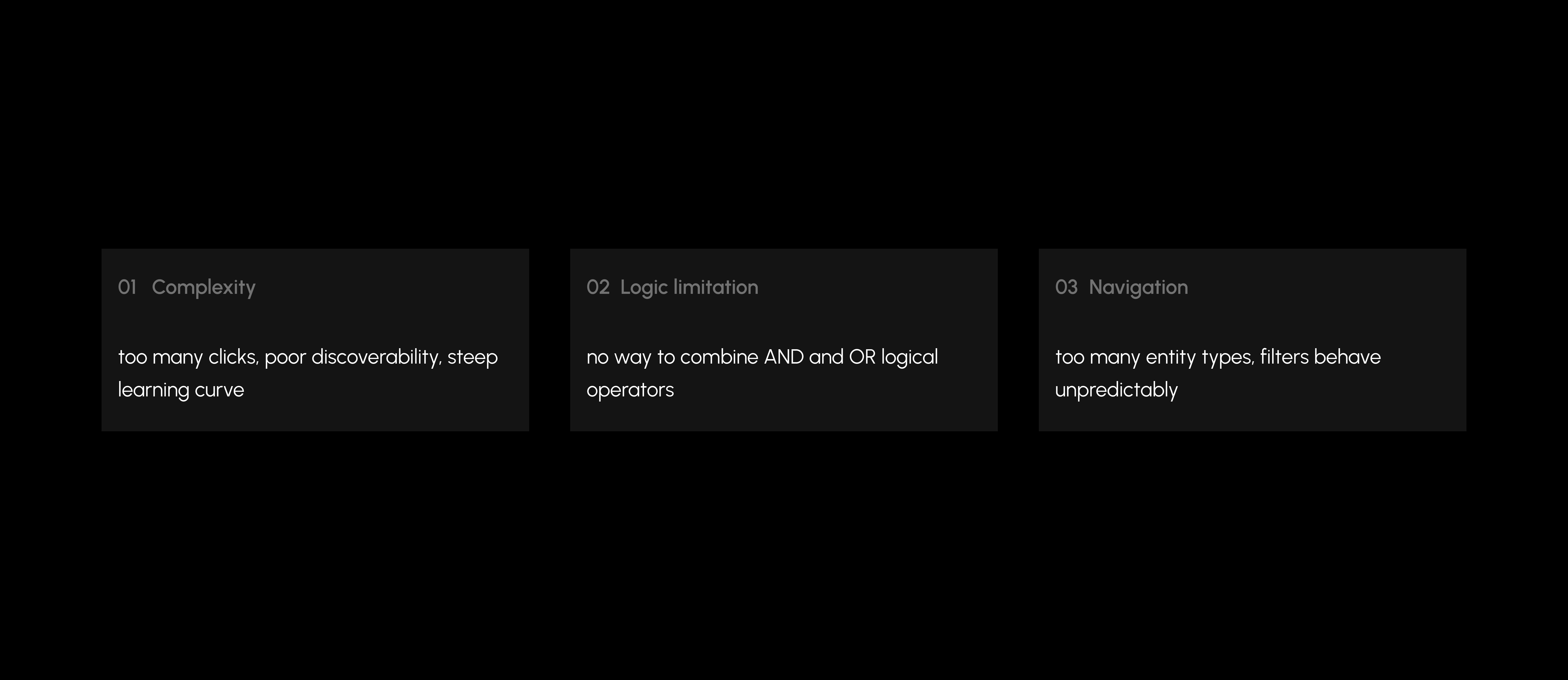
Challenges

Two filter systems that can't be merged. Simple and advanced filters work differently at a technical level. Unifying them into a single coherent UI wasn't feasible within scope. Any solution had to work alongside the existing system, not replace it.

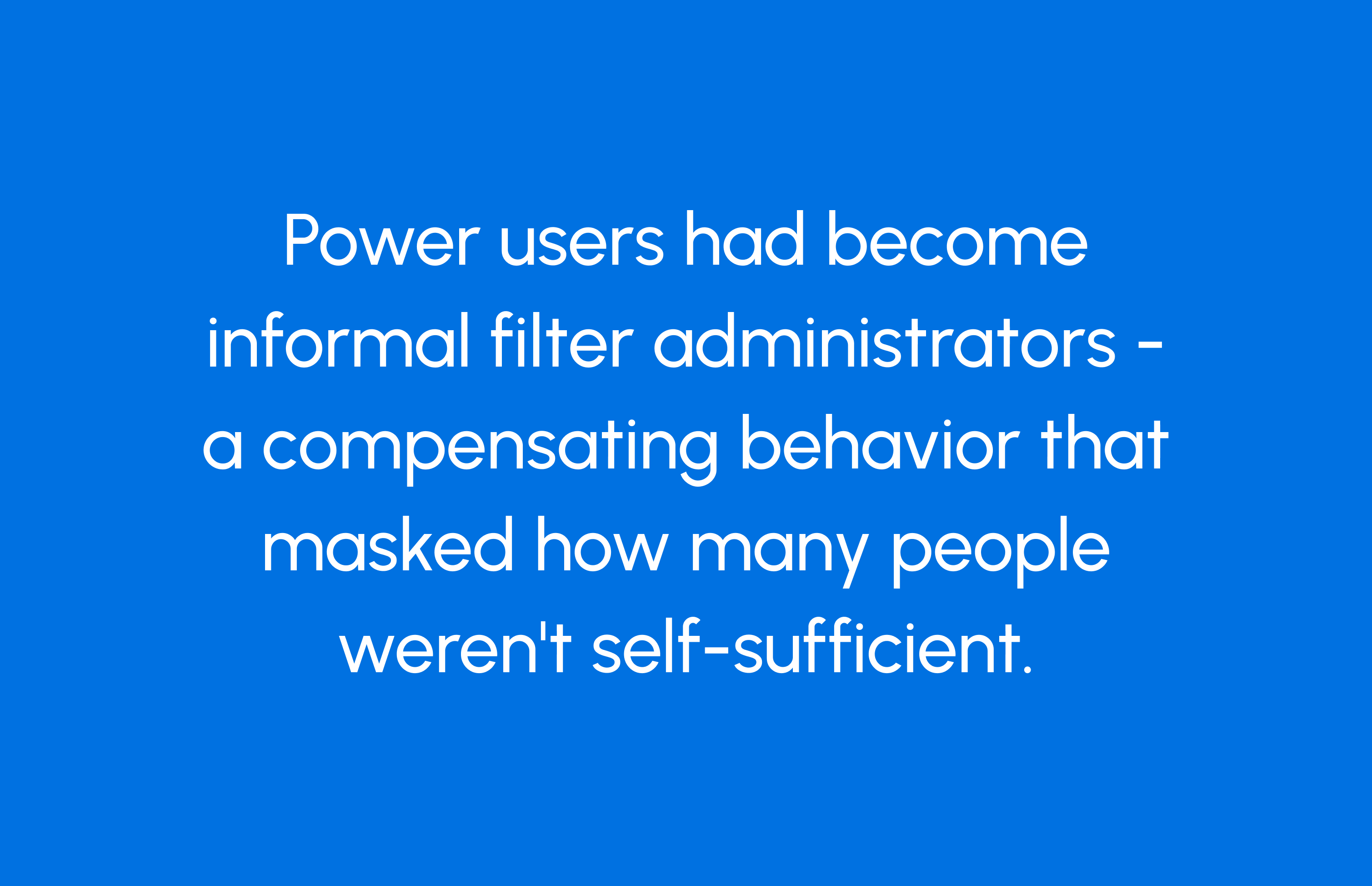
Power users had already built workarounds. In interviews, I found that technically confident users were configuring filters on behalf of their teams - setting up board views and explicitly telling colleagues "don't touch the filters." This behavioral workaround meant many users had never had to engage with filters directly. Any new design needed to work for people who had zero filter experience.

Challenges overview
design process
design process
design process
design process
design process
design process
design process
design process
design process
design process
design process
design process
design process
design process
design process
design process

Discovery

I started with the feedback. Analyzing 173 customer notes tagged to Filters UX issues, Multiple enterprise customers (including Zoom, FedEx, SalesHood, Sagent) were reporting filtering issues. Customer quotes include "My team is beginning to explore moving to new tools because of the issues we're having" and "Everyone I show the new boards to likes them until they try to filter."

I mapped complaints into three big bulks:

Discovery findings

Complexity dominated. And it was emotional, not just functional - the word "intimidated" appeared more than once.

To go deeper, I ran 6 user interviews with Product Ops managers and IC PMs across Europe and the United States. These were the people who lived in Productboard daily - both the ones who set up filters and the ones who were supposed to use them. Two things emerged clearly:

Finding AFinding B

Definition

Productboard's filter system was designed for two distinct audiences - everyday users and power users - but offered them the same experience. The result: hesitant users avoided filters entirely, delegating the task to colleagues or skipping it altogether. The insight: the emotional barrier was as real as the functional one. Users needed filtering to feel safe to try - without going too deep into understanding the entity model.

Column filters could eliminate the entire attribute-selection step. User clicks a column header. They see values relevant to that column. They pick the ones they want. There's no query to build, no model to understand. The UI reflects what's already visually true.

The design challenge was: "how do we remove the step that requires abstraction before action."

Development

I started by mapping both flows side by side - the existing board header path and the proposed column filter path.

The board header flow has a branching decision baked in: after a filter is applied, the system has to ask "does a matching column even exist?" - because the filter was chosen abstractly, with not the clearest connection to what's on screen.

The column filter flow doesn't have that problem. Because you start from the column, the context is already resolved. The flow is shorter not because it does less - but because it doesn't need to deal with a disconnection.

Flow comparison

To validate early design directions, I ran corridor testing sessions using Productboard itself - recruiting colleagues to walk through simple Figma prototype. This gave fast, low-overhead signal on whether column-based filtering felt intuitive before we committed to building.

High fidelity design

Delivery

With the concept validated in corridor testing, I designed column filters with three guiding principles:

(Contextual by default)

The filter opens from the column header. Values shown are scoped to that column. There's no global panel, no mode-switching. You're narrowing what's already in front of you.

(Minimal UI surface)

No operators, no filter groups. A search field, a list of values, checkboxes. The interaction is closer to a dropdown than a filter builder. For intimidated users, simplicity is the feature.

(Non-destructive and reversible)

Filters applied through columns are immediately visible and easy to remove. There's no state that feels permanent or dangerous - directly addressing the "don't touch it" anxiety surfaced in research.

We made an explicit decision to exclude boolean logic and advanced options from column filters. This wasn't an oversight - it was a boundary. Power users still had the full filter panel. Column filters were there to be a safe entry point for users, who were confused with an existing complex logic.

Design handoff

Conclusion

Column filters launched on grid boards in early 2026. The results validated both the hypothesis and the metric bets we made.

(Adoption)

Column header filtering launched at zero users in January. It reached 1,221 unique monthly users within two months - a 45x increase. And was still accelerating at measurement time.

(Quality of interaction)

Column filter users complete filters 2.4x faster and at a 13.7 percentage point higher rate than users entering through the board header - a meaningful quality difference, not just a volume story.

(Engagement and retention)

At peak, 2,200+ unique users applied filters weekly. The overall funnel showed 41% end-to-end conversion from opening the filter panel to successfully applying a filter.

Of the 1,581 users who tried column filtering in the first 90 days, 30% returned the following week and 13% were still active four weeks later. Fifty users used it 21–50 times in a single month - a power user cohort that emerged from a feature designed for hesitant users.

2200+

users apply filters weekly

13.7%

complete rate

2.4x

faster complete rate

Column filters moved a metric that was hard to move: the willingness of hesitant users to engage with a complex system. Not by making the system less complex, but by removing the moment that required them to understand it.

Lesson learned: when users avoid a feature, the problem isn't always the feature. Sometimes it's the step before the feature - the abstraction, the decision, the moment that breaks context. Removing that step was worth more than any UI refinement we did to the filter panel itself.

What's next.The 87.6% non-adoption rate is real. Adoption is concentrated in Enterprise and Pro tiers - Starter and Essentials users have barely touched the feature, likely because the entry point isn't visible enough at those tiers. The weekly adopter count plateaued after the initial release wave, suggesting organic discovery has run its course. Reaching the next segment would require deliberate in-product onboarding - something I'd prioritize in the next cycle.

Kanban and roadmap boards also don't have column filters (or its alternative) yet. That's a gap worth closing.

You made it here!

Let's connect