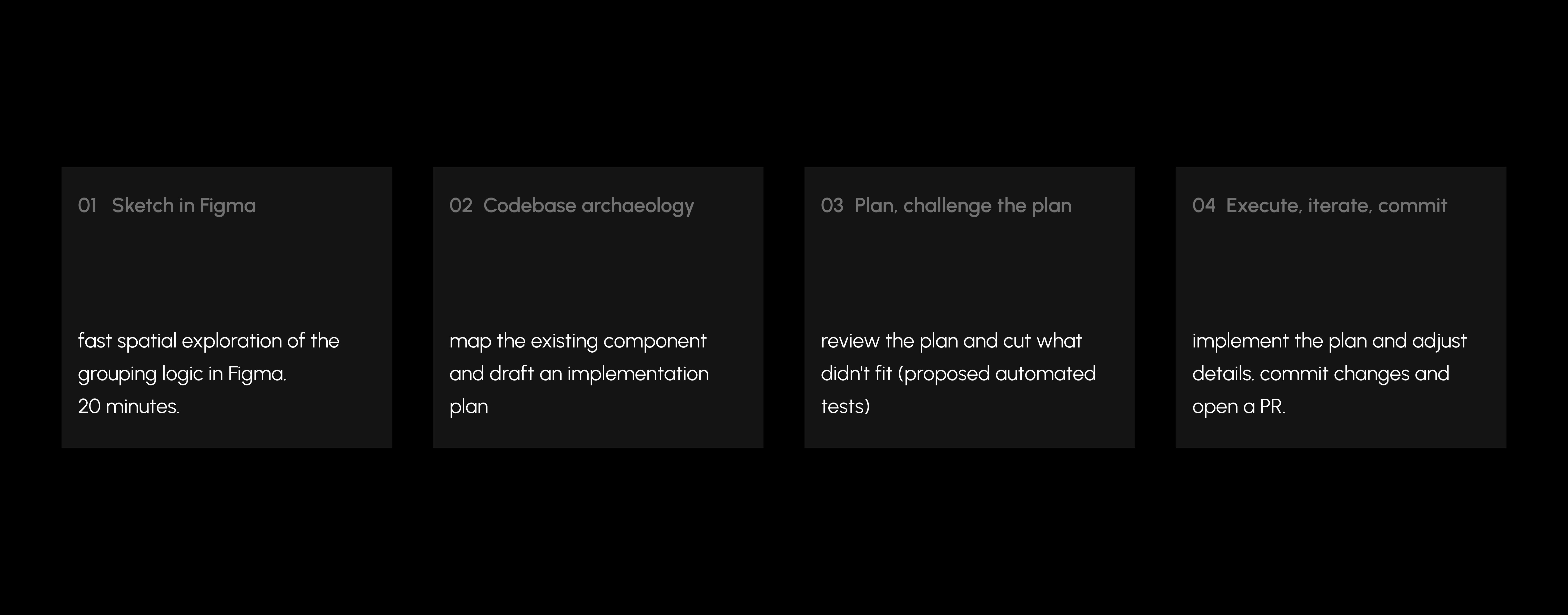
Refining the block-type picker in the document editor

Role:Design engineer
Company:Productboard
Duration:3 hours
Type:UI/UX fix
Block-type picker redesign

TL;DR

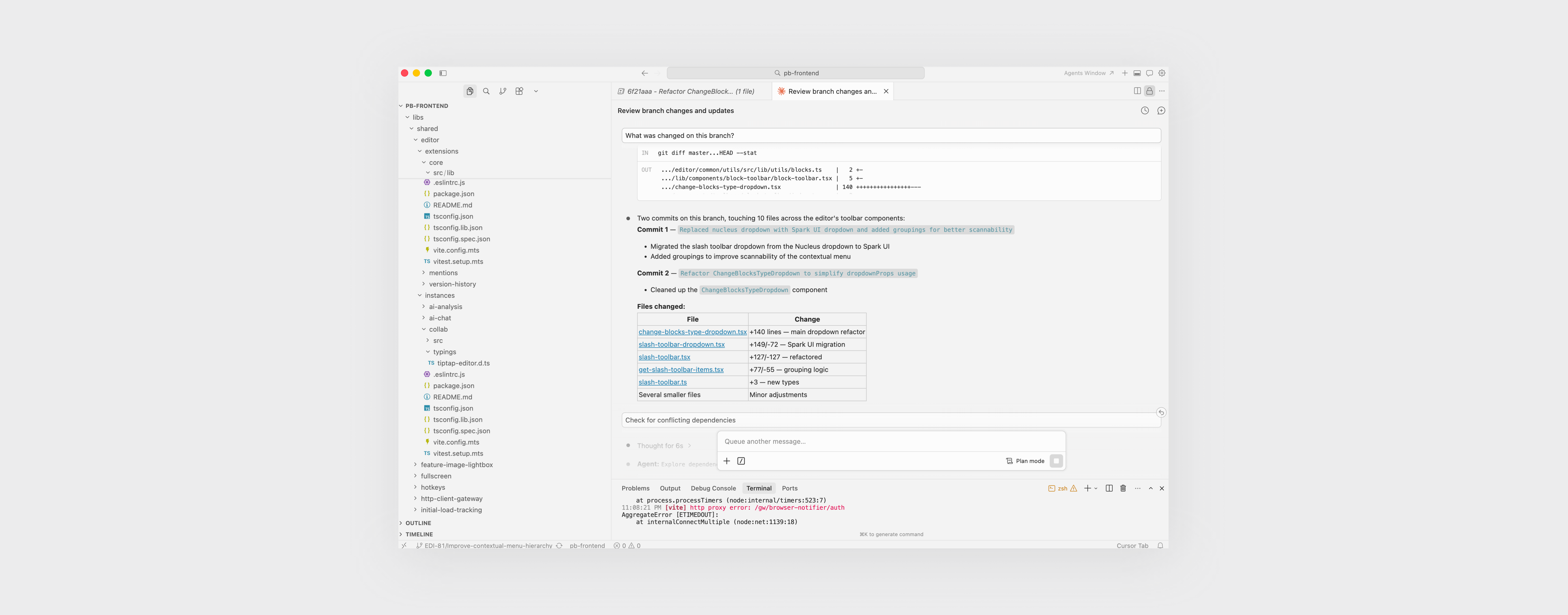
The block-type picker in Productboard's document editor had grown into a flat, hard-to-scan list. I sketched a fix, and shipped the PR myself - grouping options by type, tightening the layout, adding escape-to-close keyboard handling, and migrating the underlying component from our legacy Nucleus library to our Spark UI design system.

Problem

The block-type picker is a slash-triggered dropdown used every time someone adds a new element to a document - headings, lists, quotes, code blocks, toggles, images, dates. It had grown over time into a flat vertical list of 13+ options with no visual hierarchy.

Users, myself included, were pausing every time the menu opened to scan for the option they wanted.

It wasn't broken. It was just slower than it needed to be and completely detached from our design patterns.

ship it
ship it
ship it
ship it
ship it
ship it
ship it
ship it
ship it
ship it
ship it
ship it
ship it
ship it
ship it
ship it

Redesign

Three decisions, small and deliberate:

Group by meaning, not by file order. Text elements (headings, quote, code) separated from List elements (bullet, numbered, to-do, toggle) separated from embeds (image, date).

Balance the layout. Consistent icon sizing, tighter vertical rhythm, visible section labels so the eye lands before the hand moves.

Let keyboard users escape. Added Escape-to-close - a 5-line addition, but the kind of detail that separates "functional" from "finished."

Redesigned block-type picker

Delivery

Productboard's frontend is a large, multi-workspace codebase. I couldn't just open a file and start editing - I had to find the right file first, understand what it touched, and not break the five other places the component was used.

My loop:

Development loop

The change shipped as a single PR: the Nucleus dropdown replaced with its Spark UI equivalent, options grouped by type, and Escape-to-close added for keyboard users.

Cursor screenshot

Conclusion

This is a small surface. I want to be honest about that.

What I think it shows is the shape of work I want to do more of: noticing a friction while using the product, designing a fix that respects the system around it, and shipping the code myself without a handoff. The AI-assisted workflow made the engineering tractable - Claude Code mapped the codebase and drafted the plan, I made the judgment calls on scope, taste, and what to cut.

3 hours

of work

0 devs

cried

1 PR

small, but mighty

You made it here!

Let's connect